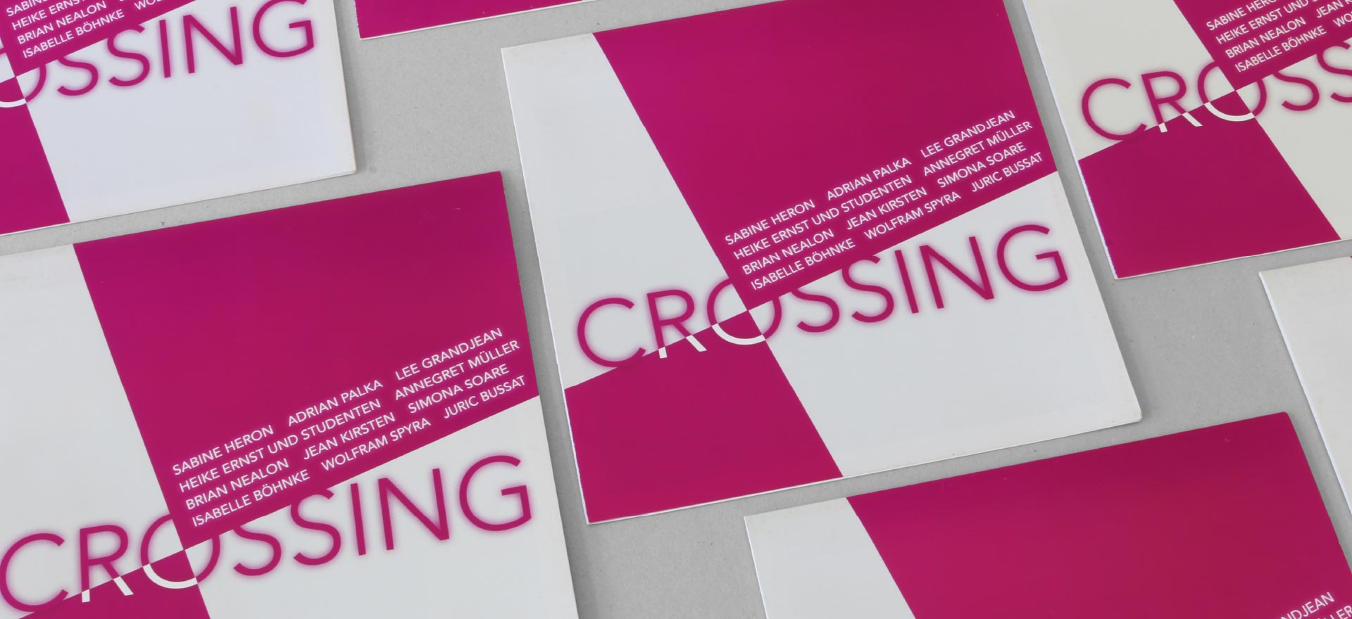

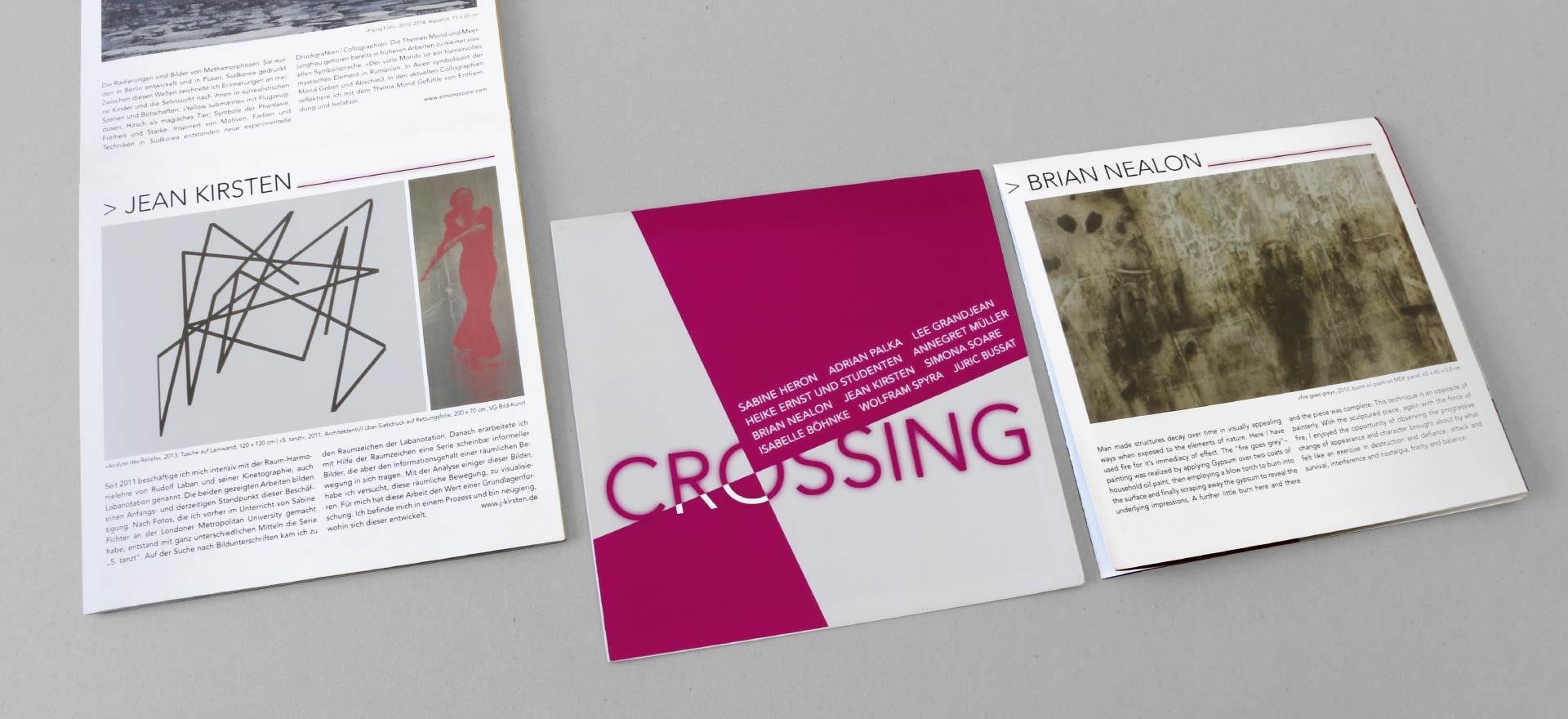
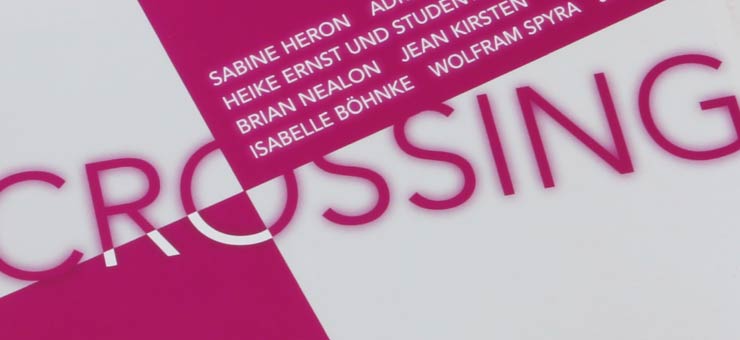


Crossing
“The Crossing logo is criss-crossed by areas of colour, and negative and positive forms are intertwined in the typography.”
Art in the Spreehöfen
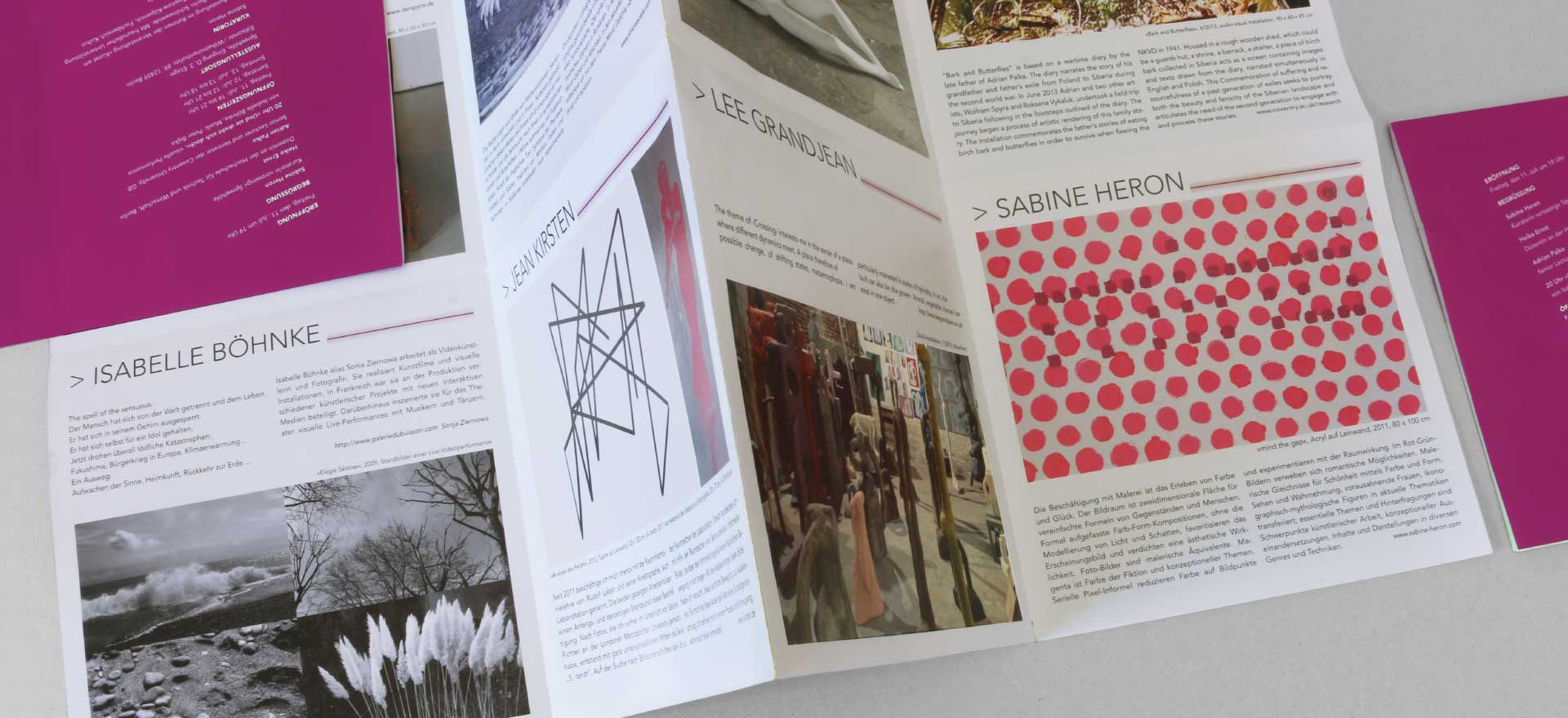
In the exhibition of ten artists quite different themes, techniques, and media come together. The exhibition draws on the Light Colour Line exhibition held two years earlier in the Spreehöfen.
Crossing, stepping over, intersecting
Starting with the title, the Studio developed a motif in which the logotype and areas of colour intersect. As many elements of the predecessor exhibition as possible are incorporated in the design so as to help preserve continuity.
- Services provided Postcard, DIN long | Leaflet, 16 pages
- Text: Sabine Heron